Analyzing my strava runs with Python, Pandas and Matplotlib
To get started I had to fetch my data from strava which you can do via the API. You need to add an application to your strava account and generate an access token, all steps are pretty well described at the beginner guide from Strava.
As soon as you generated the token the programming can start. I used a jupyter Lab for that but pure Python should also do. For fetching the data I used a special python library stravalib, which you have to install via pip. You also have to install pandas and matplotlib.
pip install stravalib pandas matplotlib
Next we fetch the data:
import pandas as pd
import matplotlib.pyplot as plt
from stravalib.client import Client

access_token = 'the-token-you-generated-before'
client = Client(access_token=access_token)
activities = client.get_activities(limit=1000)
As Strava will return a lot of information, I defined the fields that are interesting to me before and then only loaded that data into a pandas dataframe. The head() method shows me the first few rows of the dataframe.
cols = ['average_speed',
        'average_heartrate',
        'average_watts',
        'distance',
        'elapsed_time',
        'total_elevation_gain',
        'type',
        'start_date_local']

data = []
for activity in activities:
    my_dict = activity.to_dict()
    data.append([my_dict.get(x) for x in cols])

df = pd.DataFrame(data, columns=cols)
df.head()
So, no I know that my Dataframe looks like that and has the following columns.
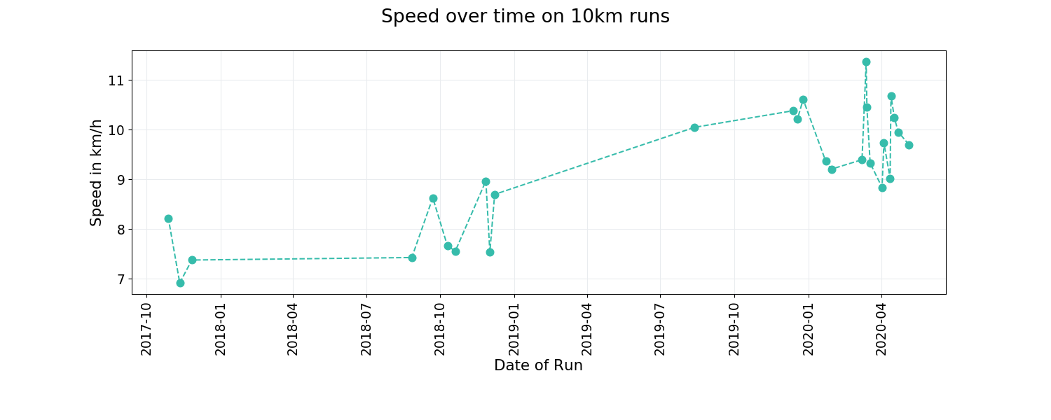
Did I become faster over the last few weeks?
As I was actually training for the half-marathon in Berlin (which was actually canceled because of the corana crisis) I was running quite frequently 3 to 5 times a week on different routes. But on Strava I can only see if I improved on one specific route but not on the same distance. So now I was wondering if the training helped to improve my speed on the 10-km-distance. So before I can analyze that I have to do some data cleaning as I only need running data (type == ‘Run’) and runs that where around 10km long. This is what the code looks like.
runs = df[df['type'] == 'Run']
condition = (runs['distance'] > 9800) & (runs['distance'] < 10200)
ten_km_runs = runs[condition]
Next I added a new column to the dataframe to add km/h instead sec/h. And the data needs to be sorted by date.
ten_km_sorted = ten_km_runs.sort_values('start_date_local',
                                        ascending=True)
ten_km_sorted['kmh'] = ten_km_sorted['average_speed'] * 3.6
Now we can generate the plot:
fig, ax = plt.subplots(figsize=(1500/96, 600/96))

# Add title and fontsizes
fig.suptitle('Speed over time', fontsize=20)
plt.xlabel('xlabel', fontsize=16)
plt.ylabel('ylabel', fontsize=16)

# Generate plot
ax.plot(ten_km_sorted['start_date_local'],
        ten_km_sorted['kmh'],
        marker='o',
        markerfacecolor='#36bcab',
        color='#36bcab', markersize=8)

# Set labels of axes and set fontsizes
ax.set_xlabel('Date of Run')
ax.set_ylabel('Speed in km/h')
ax.tick_params(axis="x", labelsize=14)
ax.tick_params(axis="y", labelsize=14)

# set color of border or hide it
ax.spines["bottom"].set_color("#e9ecef")
ax.spines["left"].set_color("#e9ecef")
ax.spines['top'].set_visible(False)
ax.spines['right'].set_visible(False)

# Add nicely formated date labels to x-axis
labels = pd.to_datetime(
    ten_km_sorted['start_date_local']).dt.strftime('%d %b, %Y')
ax.set_xticklabels(labels, rotation=90)

# Change color of grid and show it
plt.grid(color='#e9ecef')
plt.grid(True)
plt.gcf().subplots_adjust(bottom=0.3)
plt.savefig('speed.png', dpi=96)
plt.show()
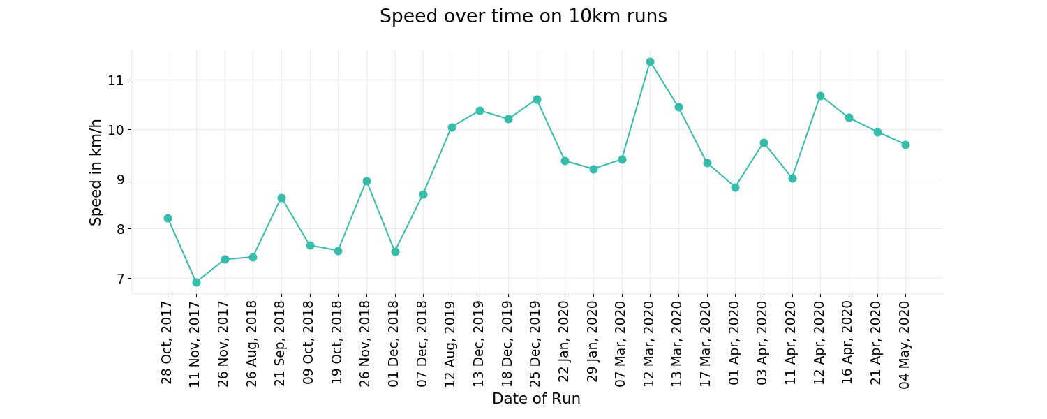
It looks a bit as if the plot is divided into two parts, one until December 2018, then a big gap and then a second part from August 2019 and me being faster. The problem is that the plot does not show the big gap. So I need to tell matplotlib that data for the x-axis are dates. So this is what I did:
df = pd.DataFrame(data, columns=cols)
df.set_index('start_date_local', inplace=True)
df.index = pd.to_datetime(df.index)

runs = df[df['type'] == 'Run']
Now I can redo the plot (I decided for a dashed line here, because I wanted to display the order of the datapoints but don’t suggest that there are more datapoints on the connecting line)